


Interior Design
Every space has a different story and every person, like life, work, peace and quiet.
At Lumen, we see interior design beyond materials, colors and furniture. We create spaces that are in harmony with your lifestyle, personality and real needs. Spaces where natural light flows, movement is fluid and every element is placed in its place with a purpose.
Our design process begins with getting to know you; from your daily habits and functional needs to the emotional quality you want to experience in the space. The result is an environment that not only looks beautiful, but also brings a sense of belonging, comfort and order.
At Lumen, we design spaces where you find opportunities to breathe.

Related projects
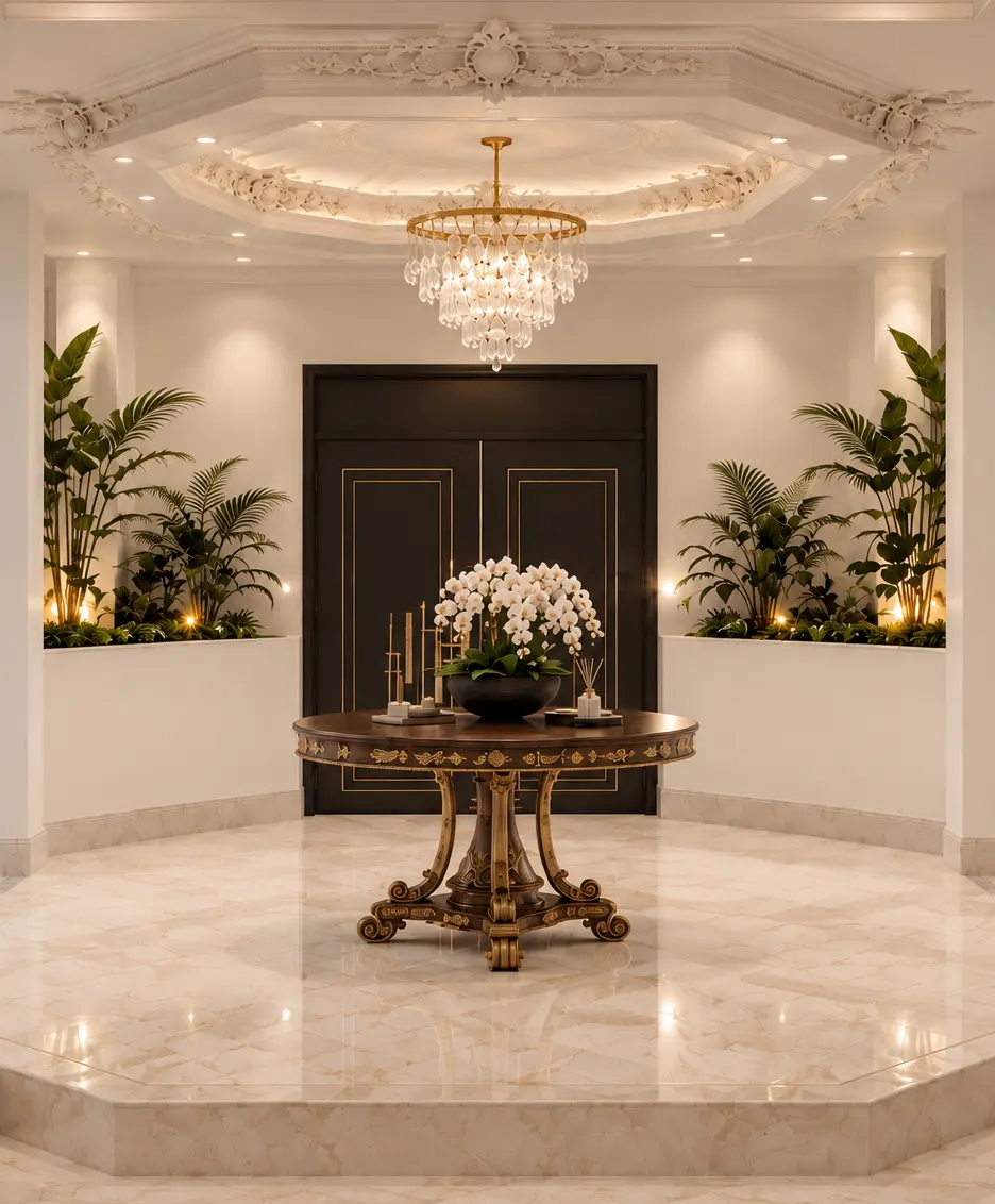
Neoclassical residential project
Classical Elegance in a Contemporary FormResidential Interior Design in the Neoclassical StyleThe interior design of this project has been developed with a Neoclassical approach and with the aim of creating a balanced, authentic, and timeless space. In this design, the distinctive elements of classical architecture have been reinterpreted with a contemporary perspective to establish harmony among the different elements of the space while preserving the identity of the style.Wall moldings, decorative columns, delicate stucco work, and classical chandeliers shape the visual structure of the space. Alongside these elements, furniture with curved forms and precise details helps maintain the cohesion and continuity of the design language.The color palette, consisting of white, cream, and beige, accompanied by subtle blue accents, creates a bright and calm setting. The selection of materials, surface finishes, and the use of combined lighting have also been carried out with the aim of highlighting architectural details and creating visual depth within the space.The result is a residential space in which classical proportions, decorative details, and contemporary choices come together to form a unified and distinctive identity.
 Amir-Kabir St. ,Kashan
 Details of project

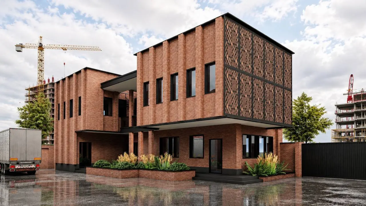
Sana Polymer Factory
Sana Polymer Factory: An Effort to Redefine Industrial Space on a Human ScaleThe Sana Polymer Factory project has been developed with an approach in which industrial architecture is not limited to meeting functional requirements; rather, it seeks to create a humane, cohesive environment with a distinct identity.In the design of this complex, brick, as a familiar and durable material, plays the primary role in shaping the architectural identity of the project. The repetition and extension of brick across the façade and interior spaces, alongside dark frames and neutral surfaces, establish a unified visual language throughout the different parts of the complex.One of the project’s distinctive elements is the perforated brick screen on the building’s façade. In addition to creating depth and rhythm across the façade, this layer acts as an intermediary between the interior and the exterior, influencing the quality of incoming light and shadow. The geometric pattern of this screen, combined with the building’s simple volumes and clear lines, gives the façade character without compromising the industrial function of the complex.The same approach continues throughout the interior. Brick, naturally textured surfaces, neutral colors, dark metals, and warm lighting come together to create a space with an industrial identity that avoids the coldness and harshness commonly associated with industrial environments. In areas such as the entrance and reception, break room, rooms, and service spaces, attention to lighting, texture, and detail has given the working environment a quality closer to that of a thoughtfully designed, human-centered architectural space.Ultimately, the Sana Polymer project is an effort to achieve a balance between function, durability, identity, and quality of experience; a place where industrial architecture can not only meet the needs of a manufacturing complex but also create an environment with character and a distinct spatial quality.
شهرک صنعتی شمس آباد Details of project 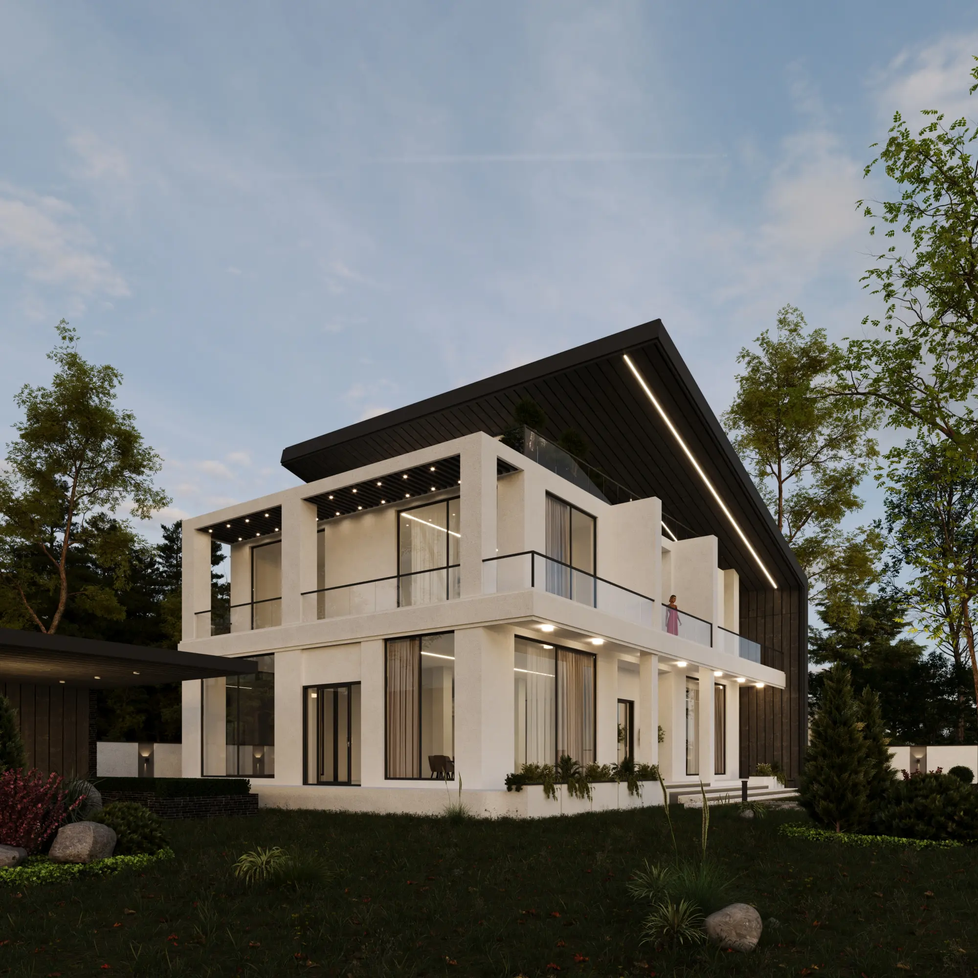
Ramsar Villa
Ramsar Villa | The Intersection of Geometry, Materials, and NatureIn the design of Ramsar Villa, the aim has been to create a contemporary building with a distinct identity by relying on geometric simplicity, a combination of pure volumes, and a considered contrast of materials. The main design concept is based on creating a balance between the building’s bright, unified volume and the dark-colored roof shell. This contrast visually distinguishes the building’s components while adding depth and character to its overall composition. The extended roof, with its angular form and continuation along the building’s façade, is one of the main elements defining the building’s silhouette. By creating a large perimeter frame, it brings the underlying volumes together in a cohesive composition. Meanwhile, precise proportions, continuous lines, and the avoidance of unnecessary details play an important role in maintaining the clarity and coherence of the project’s architecture.In the façade design, rectangular frames and vertical columns, combined with the horizontal lines of the balconies, create a geometric order that relates to the roof’s distinctive form. The light-colored façade surfaces are positioned alongside the dark roof shell and the metal window frames to clearly define the boundaries between the building’s different components. Wide openings and floor-to-ceiling windows not only provide natural light but also strengthen the visual connection between the interior spaces and the outdoor environment. In addition, the use of glass balcony railings maintains safety while preventing visual obstruction and preserving the continuity of the façade’s lines. Linear lighting along the roof and spotlights beneath the overhangs also emphasize the building’s geometry at night, presenting its architectural details in a different way.The landscaping of Ramsar Villa has been considered an integral part of the overall design and developed in harmony with the building’s geometric language. The access path, combining stone slabs and gravel beds, creates a clear approach toward the main entrance, while low-level pathway lights make this movement more legible at night. The vegetation, trees, and natural elements of the landscape also soften the rigidity of the building’s geometric composition by creating a contrast between the living textures of nature and the solid surfaces of the architecture. Overall, this project is based on the harmony between form, materials, light, and landscape—an approach in which each element is defined in relation to the building as a whole, resulting in a coherent, contemporary architectural design suited to its surrounding context.
رامسر Details of project 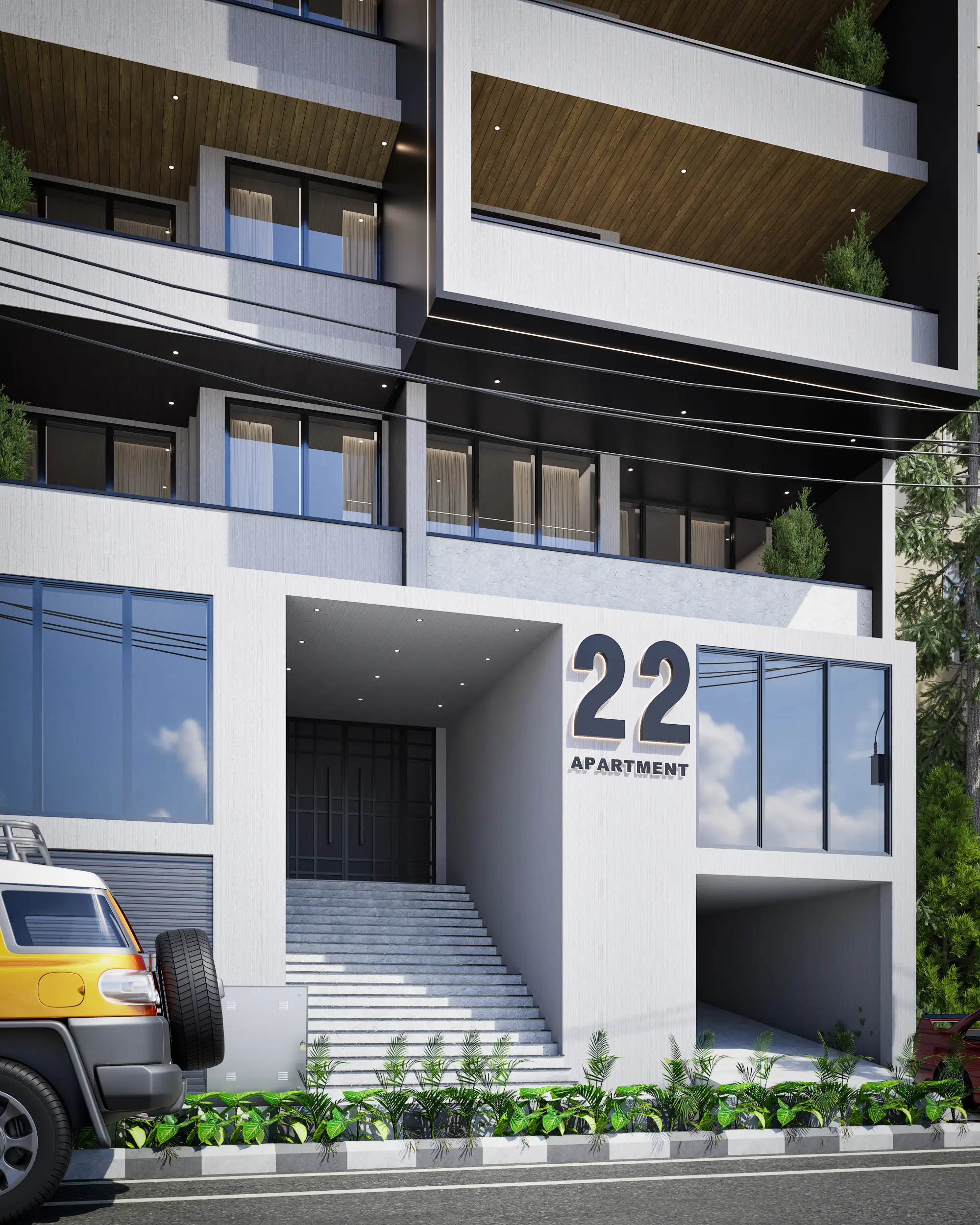
Apartment 22
Residential Apartment | Balancing Rhythm, Materials, and ProportionsIn the façade design of this residential apartment, the main focus has been on creating a contemporary identity through the combination of simple volumes, vertical and horizontal proportions, and the purposeful use of different materials. The central volume of the building, as the defining element of the composition, is distinguished from the two adjacent volumes through an emphasis on vertical extension and the regular repetition of balconies, becoming the focal point of the main façade. While maintaining the overall coherence of the building, this distinction adds visual depth to the façade composition. The repetition of floors and the horizontal lines of the balconies create a rhythmic order across the building’s height; a rhythm that is balanced by the emphasized vertical lines on either side of the central volume, reinforcing the building’s verticality.One of the main features of the design is the contrast between the light-colored façade surfaces and the wood material used on the ceilings of the balconies. The warm color and texture of the wood, alongside the neutral surfaces and dark frames of the openings, prevent visual monotony and give the building’s façade a balanced quality. The successive balconies, with their simple parapets and wide openings, not only define the horizontal layers of the façade but also provide semi-open spaces for residents to connect with the outdoor environment. The presence of plants on the balconies and greenery on the rooftop also establishes a connection between architecture and nature, softening the solidity of the building’s surfaces. In the two side volumes, the use of different patterns in the openings and shading elements introduces controlled variation while preserving the overall harmony of the complex despite the differences in detail.In the design of the building’s entrance, the change in scale and the recession of the volume distinguish the access area from the main façade. Positioning the entrance at the lower part of the central volume and using simple lines and unified surfaces enhance the legibility of the entrance route and establish a clear connection between the urban space and the residential environment. Overall, the design of this apartment is based on the harmony between rhythm, proportions, texture, and color; an approach that, by emphasizing the precise organization of façade elements and avoiding unnecessary complexity, results in a cohesive and contemporary composition.
تهران Details of project 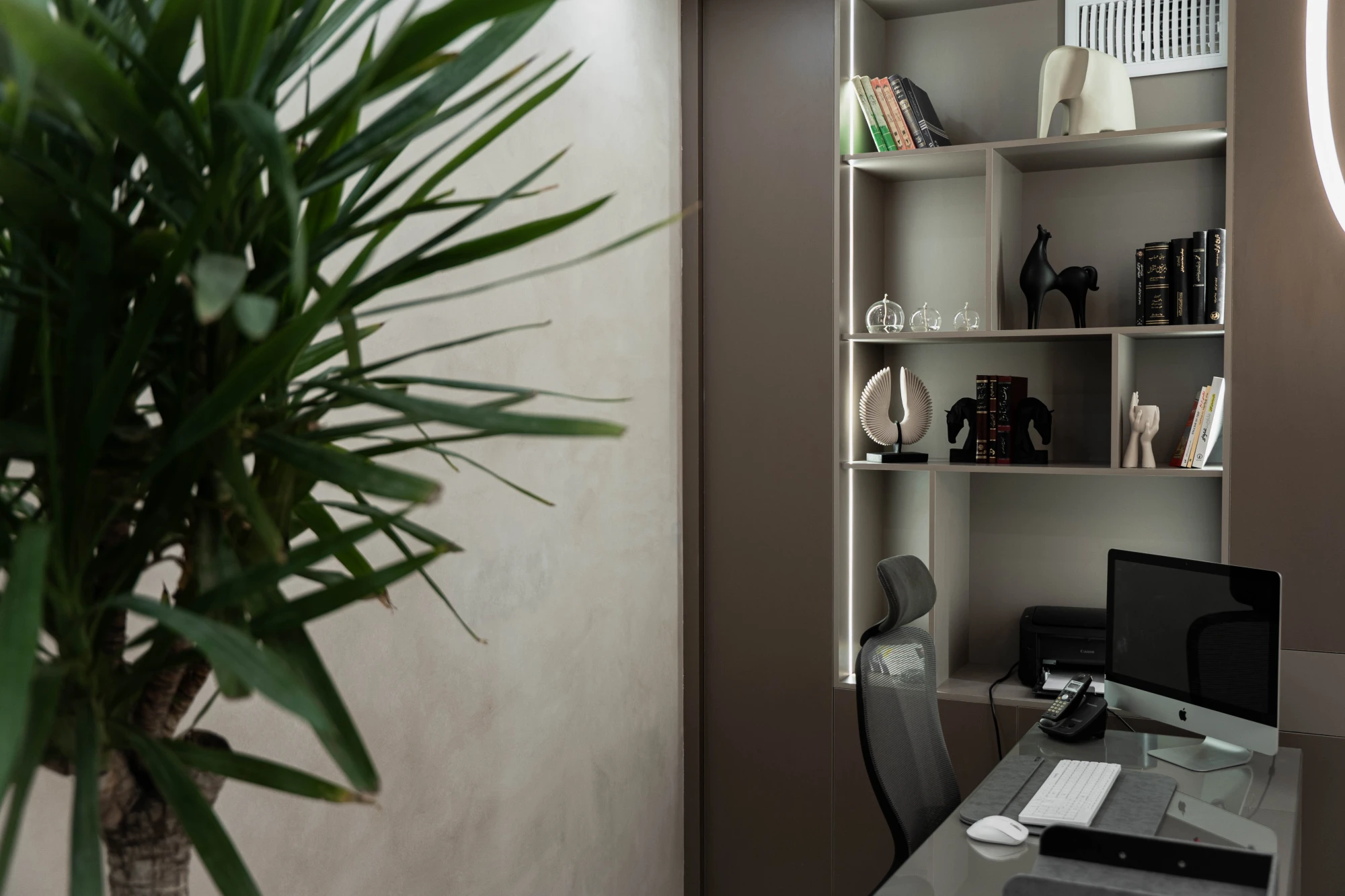
Rotana Commercial Office
Commercial Office | Balancing Function, Materials, and Spatial IdentityThe interior design of this commercial office aims to create a professional and contemporary space that, while meeting work-related needs, maintains a cohesive and distinctive visual identity. The design approach is based on a combination of natural materials, neutral colors, and simple lines; a setting where the warm texture of wood is paired with concrete-finished surfaces and shades of gray and cream, creating a balance between the solidity of an office environment and a sense of calm. The use of continuous lines in the design of the walls, ceiling, and furniture contributes to the visual unity of the space and, alongside the selection of harmonious materials, establishes a common language throughout the different areas of the office.In the management office, the desk is considered the main organizing element of the space. Its combination with integrated shelving, wooden surfaces, and minimalist details creates an orderly and functional environment. The wall-mounted bookcase, with its combination of open and closed compartments, provides not only storage space but also an opportunity to display books and decorative elements. Meanwhile, the textured walls and wooden ceiling add visual depth to the workspace and prevent the surfaces from appearing monotonous. Lighting, as an integral part of the interior architectural design, combines linear lights, spotlights, and decorative fixtures to provide the required illumination while emphasizing material textures and the forms of distinctive elements.In the meeting room, the same design language continues with a different approach. A glass table, simple chairs, and a combination of light-colored surfaces with wooden and textured walls create a space suited to professional interactions. Adjacent to this area, a dedicated relaxation space offers an opportunity to step away from the daily work routine and adds variety to the experience of being in the office environment. Overall, the design of this office is based on achieving a balance between functionality, visual quality, and user comfort—a space in which the selection of materials, lighting design, and attention to detail serve to create a cohesive environment suited to the nature of the organization’s activities.
کاشان Details of project 
Peacock Project
Tavous | Elegance in Simplicity, Balance in SpaceThe interior design of the Tavous Commercial Office is based on a calm and sensory approach to minimalism; an approach in which simplicity does not mean eliminating identity, but rather provides a foundation for highlighting the quality of materials, proportions, and details. The main concept of the project is to create a professional and contemporary environment that conveys a sense of calm and balance while maintaining elegance and a luxurious quality. To achieve this goal, the color palette has been developed around neutral tones, including cream, gray, and brown. The combination of these colors with the warm texture of wood and uniform surfaces creates a harmonious space free from visual clutter; a space in which each element has been carefully selected and gains meaning through its relationship with the overall design.In the management office, the design of the feature wall behind the desk, incorporating an arched form, concealed lighting, and the company’s logo, helps establish a focal point within the space. The contrast between light and dark surfaces, alongside delicate details and warm lighting, gives this area a distinct visual identity. The furniture has been selected with simple forms and soft lines to create a balance between solidity and softness alongside the geometric structure of the space. In the meeting room, the table, with its distinctive design and sculptural base, goes beyond being a functional element and becomes part of the design identity. Built-in shelving, wooden surfaces, and a combination of matte materials, alongside linear lighting and a decorative light fixture with a fluid form, add depth and character to the space without compromising the overall coherence of the design.Lighting in this project is not limited to providing illumination; rather, it is one of the main tools used to shape the spatial experience. Linear and concealed lighting highlights architectural lines and material textures, while the warm light of decorative fixtures reduces the potential austerity of the office environment. Alongside these elements, the selection of natural materials and attention to construction details help create continuity between the different areas of the office. The result of this approach is a space in which luxury is not defined through excessive ornamentation, but emerges from the quality of combinations, attention to detail, and harmony between elements; a space with a calm, contemporary, and distinctive identity that, while maintaining its formal character, offers a pleasant experience of being in the workplace.
کاشان Details of project